Case study · Renewed & Rebuilt

healthcare platform
Five areas of a home- and community-based care platform were rebuilt on one design system. Each section opens with the legacy screens it replaced, then the rebuild, at the scale the work was designed at. Where a screen has more than one state, the states share a frame you can switch between.
Role
Lead Product Designer
Rebuilt screens
29 across 5 areas
Legacy screens shown
19 captures
Shipped
[NEEDS COPY: date]
Renewed & Rebuilt / 01
Home screen
1 legacy capture → 1 rebuilt screen
01
Legacy build → Final homescreen
drag to compare · scroll the frame
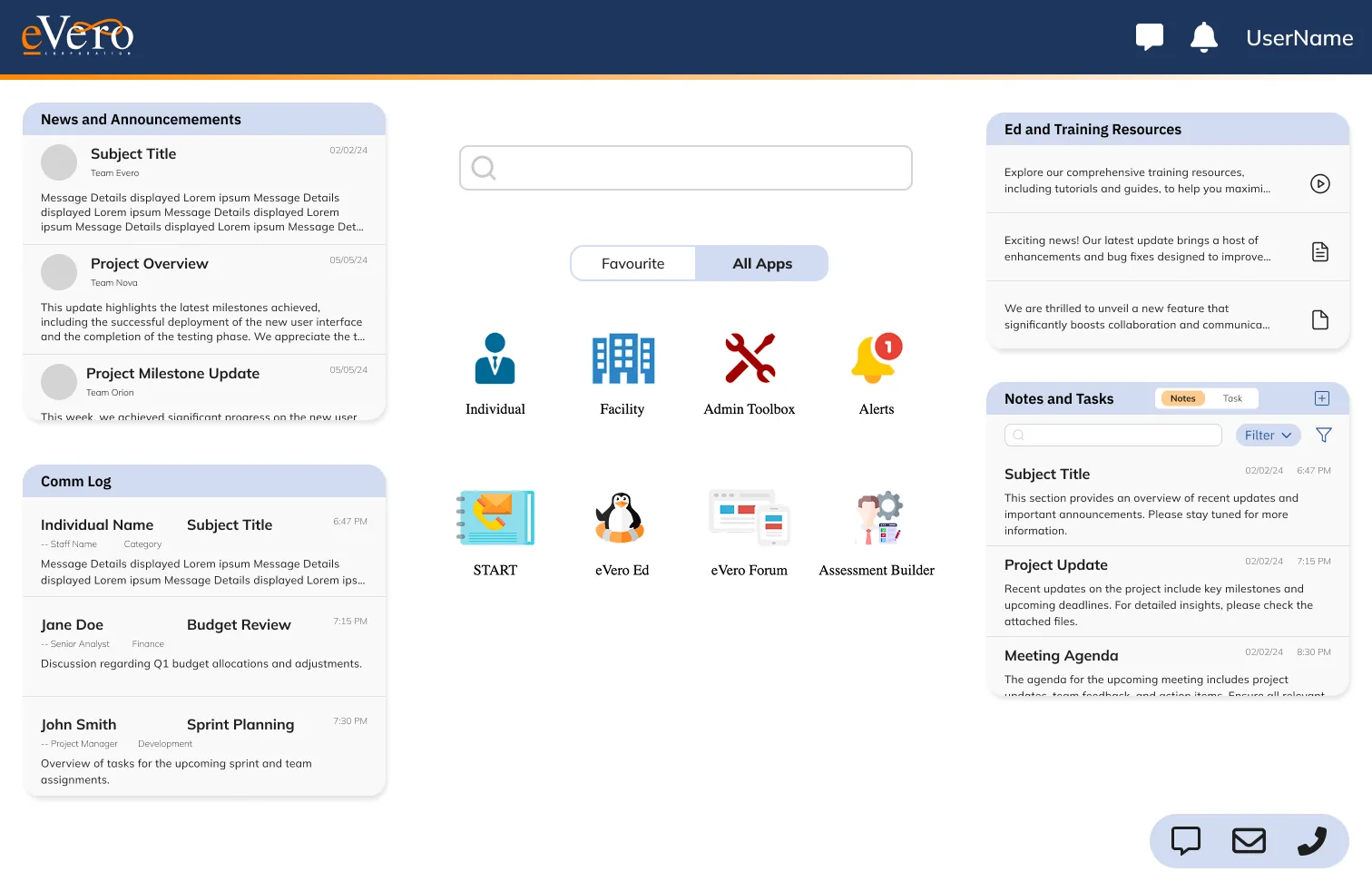

Old Home Screen. [NEEDS COPY: what a direct support professional had to do here at the start of a shift, and what the screen did not tell them].
[NEEDS COPY: what the widget set was chosen to answer, and which of the old screen's items were dropped].
Renewed & Rebuilt / 02
Communication Log
9 legacy captures → 5 rebuilt screens
Before · the log, as found


Nine captures, no shared state.
Kept small on purpose — the point is the count, not the detail. [NEEDS COPY: what staff did to work around it, one clause].
01
Global Log Dashboard

Nothing in the old build answered what happened with a person today without opening several windows across several modules. One surface now carries that question, with unread, draft and needs-action as tags rather than separate screens.
02
Global Log Repo
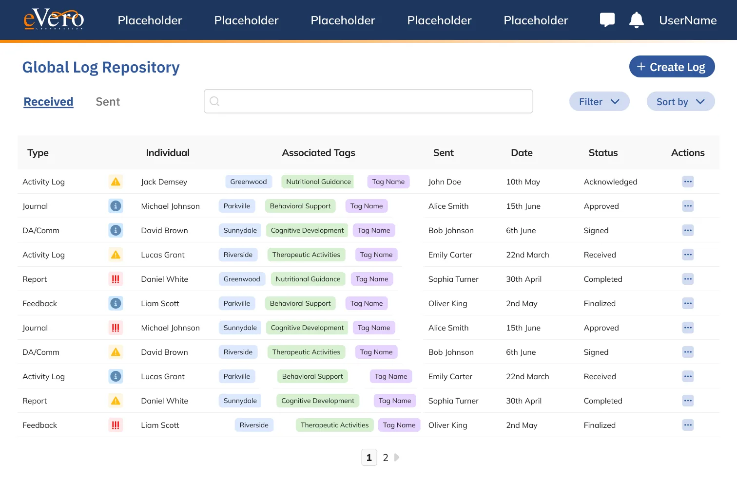
Records lived in whichever module created them, so the same contact could exist twice with different dates. One repository now holds every entry, filtered rather than duplicated.
03
Log Repo Expanded

Reading a full entry used to mean leaving the list and losing your place in it. [NEEDS COPY: what the expanded row keeps in view].
04
Create Log

Entry required a long field list, most of it defaulted to the same value every shift. [NEEDS COPY: which fields were removed, and what became conditional].
05
Opened / Display Log
A logged note is evidence in an audit but printed like a memo. [NEEDS COPY: what the display state had to prove, and to whom].
Renewed & Rebuilt / 03
Case & Enrollment
8 legacy captures → 10 rebuilt screens in 5 frames · view and edit states share a frame
Before · enrollment management, 8 captures


EM SS · EM SS2. [NEEDS COPY: what an intake coordinator had to reconcile across these eight views before a person could be enrolled].
After · the patient record, one viewer
Ten rebuilt screens resolve into five frames: the record splits into a view state and an edit state at every level, so a coordinator can read without risking a change. Pick a frame on the left, then switch its state. Frames marked scrolls are taller than a viewport.
The record
The long forms
Finding people
General Information
Allergies & conditions
Medical detail
Health Info
Person search
Single state


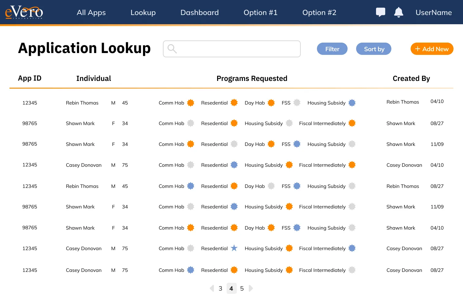


General Information. Reading and editing are the same screen. [NEEDS COPY: one line on what became editable in place].
Allergies & conditions. [NEEDS COPY: one line on the toggle-driven sections].
Medical detail. One form, two states: collapsed on open, expanded once a section is switched on. [NEEDS COPY: why this form stayed long instead of becoming a wizard].
Health Info. The tallest frame in the set. [NEEDS COPY: who reads this end to end, and what they are checking].
Person search. One table component, three configurations: full width, paginated, and paired with a detail panel. [NEEDS COPY: which screens use which, and why the side panel was worth the width].
Renewed & Rebuilt / 04
Visit verification & billing
8 rebuilt screens in one viewer · no legacy capture in the source file
Electronic visit verification runs on a clock and a location, both of which have to be defensible months later. [NEEDS COPY: the compliance requirement that shaped this flow].


EVV Action Start. What has to be true before a visit can start. [NEEDS COPY].
FOB verification. The fallback when there is no signal: a device code stands in for the location check. [NEEDS COPY: how often this path is used].
Billing Report. [NEEDS COPY: what a biller is reconciling here].
Payment. [NEEDS COPY: one line on the payment surface].
Profile View. Multi-factor settings sit with the profile rather than in a separate security area.
Profile Edit. [NEEDS COPY: what changed about saving].
Visit Summary. What the visit produced — location, times, and the note — on one page a reviewer can read straight through.
Past Log. Completed visits in date order, with status and note visible without opening a row.
Renewed & Rebuilt / 05
Education & Training
1 legacy comparison · Evero U walkthrough, 4 screens
“What if learning to use a complex platform felt as seamless as browsing Youtube?”
Evero U is our reimagined onboarding ecosystem designed to be more than a content library—it’s an interactive, role-based learning platform that streamlines implementation and boosts user confidence. By borrowing proven patterns from top edTech products and infusing it with thoughtful UX, we turned training into a scalable, engaging experience. Focusing on clarity, simplicity, and trust.
01
eVero Ed → eVero ED
drag to compare · scroll the frame

Everoed. [NEEDS COPY: what a learner could not find here, and what a manager could not see].
The landing page for the learning product: webinars, a calendar, and the learner’s own status in one column. [NEEDS COPY: what the top card is meant to prompt].
Inside eVero ED
Four surfaces, one navigation
A four-item nav — Home, My Assignments, My Progress, Learning Library — serves learners, learning managers and agency admins alike; what changes is the data behind it, not the layout. The walkthrough runs on its own; pick a step to hold on one screen.


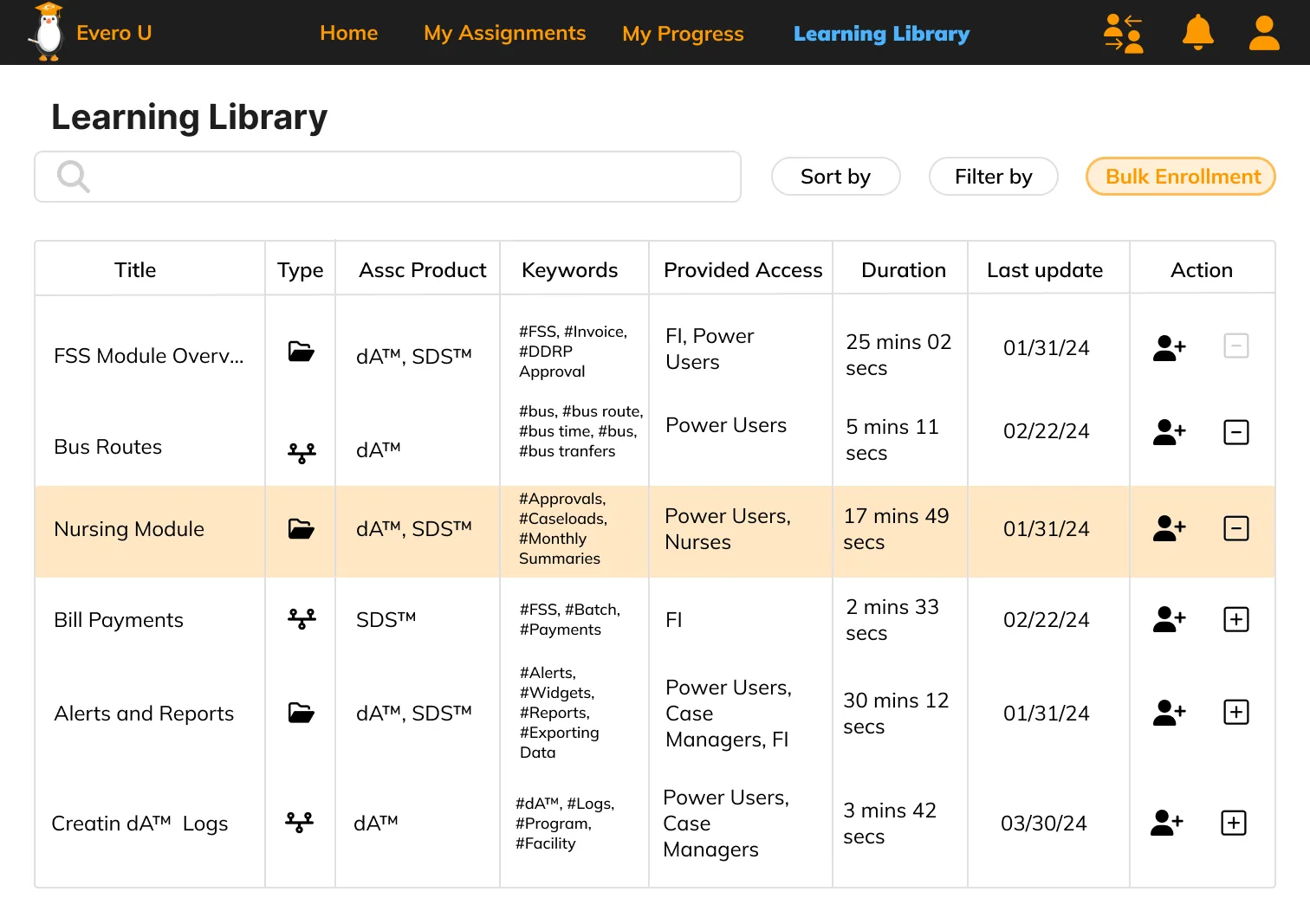
01 / 04 · Home
02 / 04 · My Assignments
03 / 04 · My Progress
04 / 04 · Learning Library